TabsMonster CSS Art (with :hover and @keyframe animation)

In this article, we will be looking at building a CSS Art with animations(BONUS)
Creating the Static monster
Before we begin let us look at the relative positioning unit used in this article -
Using rem in CSS
remis equal to the computed value of font-size on the root element. When specified on the font-size property of the root element, the rem units refer to the property’s initial value.
This means that 1rem equals the font size of the HTML element (which for most browsers has a default value of 16px).
But using multiples of 16px will not be convenient, so we change the root size(font-size of html) to 10px by setting font-size :62.5%;
html {
  font-size: 62.5%;
}
After this, all sizes will be relative to 10px.. 25rem would be 250px and so on....
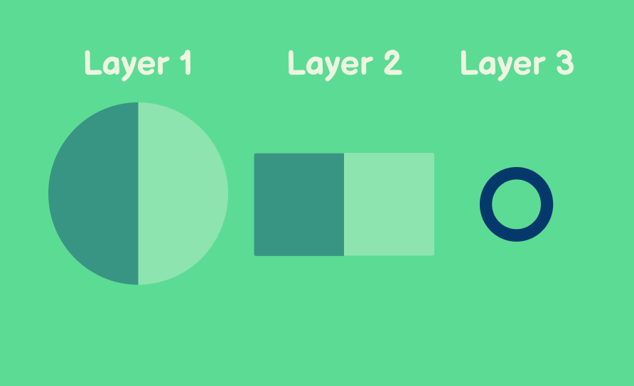
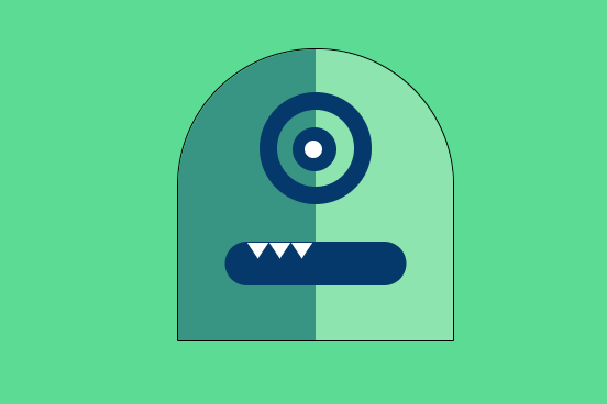
Dividing the Art into Layers
We need to divide and make the following Layers with HTML and CSS and wrap them in a single HTML element.
<div class="logo">

  <div class="monster__body">
<!--     Layer 1 -->
    <div class="monster__circle">
    </div>


<!--   Layer 2   -->
    <div class="monster__rectangle">
    </div>
<!--   Layer 3  -->
    <div class = "eye-ball-space">
    </div>

  </div>

</div>
the logo is used to provide the background color and center everything whereas the .monster__body is just a wrapper class in which the layers will exist with a position: relative property.
.logo {
width: 100%;
height: 40rem;
background-color: #5CDB94;
display: flex;
align-items: center;
justify-content: center;
position: relative;
}
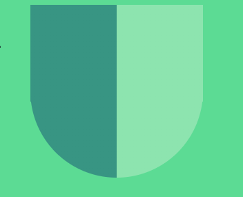
.monster__body {
position: relative;
height: 26.5rem;
width: 25rem;
border-radius:12.5rem 12.5rem 0 0;
}
Layer 1
Looking at Layer 1, it looks like we need two semi circles of two different colors joined together.
Had it been a simple circle with a color, it would have been easier to make.
That's the NEAT part, there is only one circle , just the background color is divided into two.
Let's see how that happens..
.monster__circle {
  width: 25rem;
  height: 25rem;
  border-radius: 50%;
  position: absolute;
  z-index: 1;
  background-color: #389583;
}
This CSS style will create a circle, but for single color.
Instead of background-color property, we need the background be set to a linear gradient.
Something like
background: linear-gradient(#389583 50%, #8DE4AF 50%);
What this will do is divide the first 50% of the background into the color #389583 and the next 50% in the color #8DE4AF .
And voila, your circle which looks like two semi-circles will be ready..
But WAIT!!!
Don't we need the semi-circles divided vertically instead of horizontally??
For that, just rotate the linear-gradient to a 90deg,
background: linear-gradient(90deg, #389583 50%, #8DE4AF 50%);
Layer 2
As you would have guessed by now, the rectangle will also have a similar background as for Layer 1
.monster__rectangle {
  width: 25rem;
  height: 14rem;
  position: absolute;
  bottom:0;
  z-index: 2;
  background: linear-gradient(90deg, #389583 50%, #8DE4AF 50%);
}
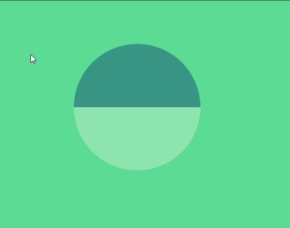
As soon as you add this class, an inverted monster body will be visible..
This happens because if in position:relative , if no value for top and left are provided, the default is taken as 0 .
Here, both the circle element and the rectangle will have position as left :0 ; , top:0;.
If we push the rectangle to the bottom, we will get our desired result.
Adding bottom as zero, we can position the .monster__rectangle relative to the .monster__body .. i.e touching the bottom.
bottom:0;
Layer 3
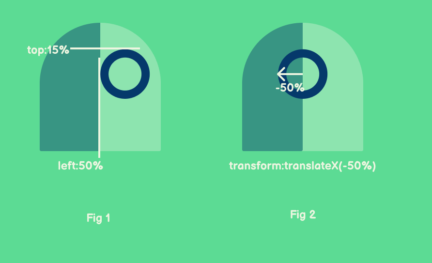
The third layer is just a transparent square with border-radius of 50% and a solid border of blue color.
.eye-ball-space {
position: absolute;
z-index: 3;
width: 7rem;
height: 7rem;
border-radius: 50%;
background-color: transparent;
border: 16px solid #05396B;
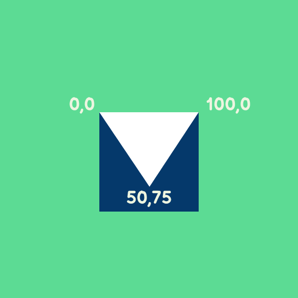
top: 15%;
left: 50%;
transform: translateX(-50%);
overflow: hidden;
}
Here the top: 15%;left: 50%; will position the Layer 3 as shown in Fig 1 and the transform: translateX(-50%) will move the Layer 3 as shown in Fig 2.
Creating the Eye Balls
<!--   Layer 3  -->
    <div class = "eye-ball-space">
        <div class = "eye-ball">
          <div class="inner-eye-ball">
          </div>
      </div>
    </div>
Here the eye-ball and inner-eye-ball are squares of appropriate sizes with a border radius of 50%.
They set to absolute position with trial and error.
There is no significance of the position of both unless animations are involved(they are involved later in this article)
.eye-ball {
  position: absolute;
  top: 60%;
  left: 65%;

  transform: translate(-50%, -50%);
  background-color: #05396B;
  border-radius: 50%;
  height: 40px;
  width: 40px;
  overflow: hidden;
  z-index: -1;
}

.inner-eye-ball {
  position: absolute;
  height: 16px;
  width: 16px;
  background-color: white;
  border-radius: 50%;
  top: 20%;
  left: 40%;
}
Creating the Mouth and Teeth
<!--   Layer 2   -->
    <div class="monster__rectangle">
       <div class="monster__mouth">
        <div class="monster__teeth"></div>
        <div class="monster__teeth"></div>
        <div class="monster__teeth"></div>

      </div>
    </div>
The monster__mouth is a rectangle with curved corners positioned centrally in the monster__rectangle .
.monster__mouth {
  width: 16.5rem;
  height: 4rem;
  border-radius: 2rem;
  background-color: #05396B;
  position: absolute;
  top: 50%;
  left: 50%;
  transform: translate(-50%, -50%);
  display: flex;
  overflow: hidden;
}

.monster__teeth {
  margin-top: 1px;
  width: 2rem;
  height: 2rem;
  background-color: white;
  clip-path: polygon(0 0, 50% 75%, 100% 0)

}

.monster__teeth:first-child {
  margin-left: 2rem;
}
As for the .monster__teeth , these triangles are made using the clip-path property set to polygon which will be the coordinates in a square. (The blue square is just given for reference.)
The .monster__teeth:first-child property selects the first teeth and gives it a margin of 2rem.
All other teeth remain stacked to each other(because of display:flex of the parent .monster__mouth ).
BONUS : Adding Animations
For the animation that we are going to add, we will need to update a few properties in the previously added classes. Please make the changes/replace code of all the classes shown in the code snippets below.
Adding @keyframes to eyes
According to MDN Web Docs
The
@keyframesCSS at-rule controls the intermediate steps in a CSS animation sequence by defining styles for keyframes (or waypoints) along the animation sequence. This gives more control over the intermediate steps of the animation sequence than transitions.
@keyframes roll-inner {
  0% {
    left: 30%;
  }
  33% {
    left: 0%;
  }
  66% {
    left: 60%;
  }
  100% {
    left: 30%;
  }
}

@keyframes roll {
  0% {
    left: 23%;
  }
  33% {
    left: 0%;
  }
  66% {
    left: 45%;
  }
  100% {
    left: 23%;
  }
}
In the above code, we have created two keyframes, one for the inner eye and one for the eye.
The @keyframe animation is divided into three equal parts, starting from 0%and ending at 100% , with the position of the eye and inner-eye visualized in the image below.
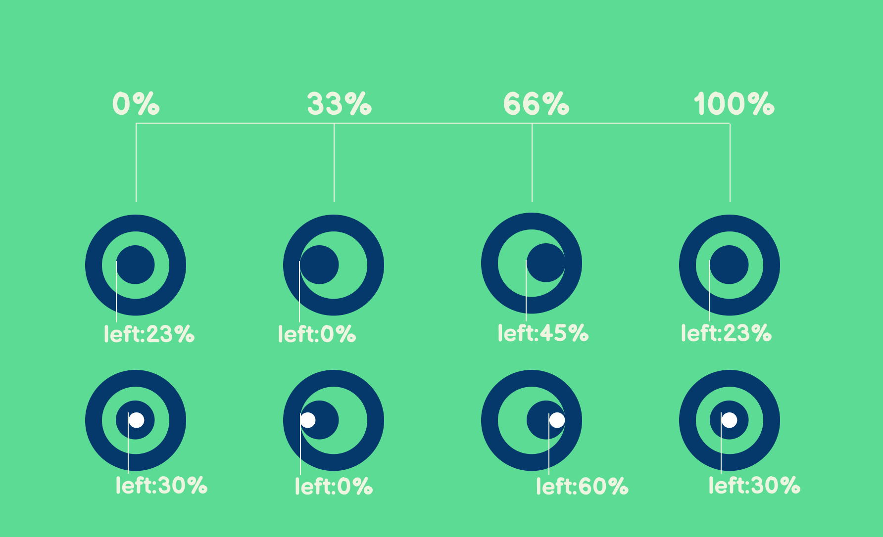
Now we just add the animation property to the respective keyframe name, with a time period of 3s and set to infinite.
.eye-ball {
  position: absolute;
  top: 23%;
  left: 23%;
  background-color: #05396B;
  border-radius: 50%;
  height: 40px;
  width: 40px;
  overflow: hidden;
  z-index: -1;
  animation:roll 3s infinite;
}

.inner-eye-ball {
  position: absolute;
  height: 16px;
  width: 16px;
  background-color: white;
  border-radius: 50%;
  top: 30%;
  left: 30%;
  animation:roll-inner 3s infinite;
}
Adding :hover Animation on Teeth
.monster__teeth {
  margin-top: 1px;
  width: 2rem;
  height: 2rem;
  background-color: white;
  clip-path: polygon(0 0, 50% 75%, 100% 0);
  transition: 0.4s;
}
.monster__body:hover .monster__teeth{
  transform: translateY(-60%);
  transition:.4s;
}
Whenever we hover over .monster__body , two things will happen
.monster__teethwill move in the upward direction because of thetranslateY(-60%)property.transition:.4swill smoothen the movement instead of sudden displacement.
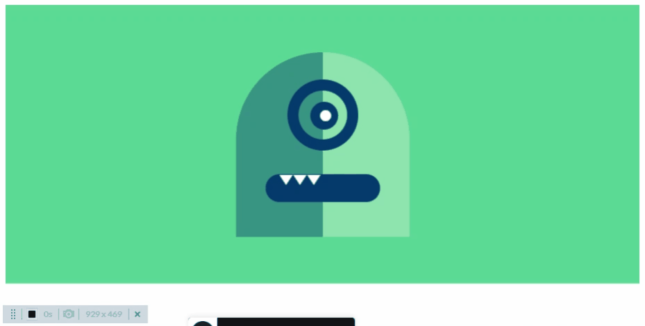
There is one small issue though 😟
If we apply border to the .monster__body class , we can see that we have extra area that comes under the monster body.
And when we hover in this area, the .monster-teeth transition would still take place.
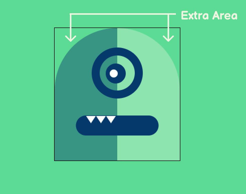
To fix that ,we will simply add border-radius to the .monster__body class.
.monster__body {
  position: relative;
  height: 26.5rem;
  width: 25rem;
  border-radius:12.5rem 12.5rem 0 0;
  border:1px solid black;
  /*border used for demo purpose*/
}
Now the hover will work as expected !! You can hover over and check that here below!
Conclusion
This concludes the tabsMonster mascot Art with CSS Animations.
Wouldn't adding JS Animations make it more awesome???.
I did add some JS animations in the final version, you can check it out here.
In case you have any doubts or suggestions regarding the article(s), feel free to contact me on my email aunicorndeveloper@gmail.com or on Twitter at @aUnicornDev.
The CSS Art built in this articles used in the tabsMonster project. Everyone is more than welcome to checkout and contribute in this Open Source Project.


